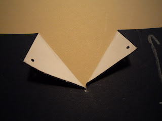
What does this sketch say to you? To me, it looks like a pocket on a shirt. Immediately it reminded me of the shirts my dad used to wear. The button up ones with the breast pocket. He used his to carry his cigarettes and lighter. He never wore a shirt without a pocket. God forbid he be without his smokes. When he passed, we buried him with a pack of cigarettes in his breast pocket. Too much information? Sorry, took a short trip down memory lane. Thinking about my dad always makes me smile!
Anyway, back on track. Since the card reminded me of a gentleman's shirt, I decided to make a masculine card that looks like one of my dad's shirts. And for a further challenge, I decided to see if I could do it without the help of my Cricut. To do it on the Cricut would have been much easier, as all I would have had to do is pick a cut file and cut. But, not everyone has a Cricut. So I set off to make this:
It's interactive:
OK, here's the scoop:
1. Decide how big you want your card to be. If you want the collar to be a different color than the shirt, adhere a strip of chosen color to the back of the card.
2. Find the center and cut straight down until you feel you have cut enough to make a good collar. Fold the collar back.
3. Punch holes through the collar and shirt where the buttons should be and use brads to hold the collar down:
4. Choose a coordinating paper for the tie. On the paper, draw a tie shape and cut it out.
You can see that I changed my mind on the width of the tie several times.
5. Adhere tie to shirt
6. Make pocket. I chose to make mine match the shirt, but you can do anything you want with it. I kind of just messed around with it until I was satisfied with the shape and size. If you choose to make the pocket interactive, make sure you do not adhere the top of the pocket to the card and do not glue/tape down the center. Only adhere the very edges.
I made mine interactive, so I made a small tag that says Dad to put in the pocket.
Oh, I forgot, because I wanted my pocket to be a little more noticeable, I hand stitched the outer edges of the pocket before I adhered it to the shirt.
7. Now you can adhere the shirt to the front of the card. You will notice that you will be able to see the base card because of the collar. You can leave it that way, add coordinating paper behind the collar, or cut out the triangle where the collar is, which is what I chose to do.
The biggest challenge for me was the tie. It took me a bit to get a shape I was happy with. I just had to keep messing with it, I did add a brad for a tie back sort of thing. After I punched it, I realized it should have been up higher on the tie, but I think it still looks cute.
I hope you find this card as cute as I do. But, then again, I am biased.
Miranda


Very fun (and very kind of you to post all the instructions and measurements!) Thanks so much for playing along with us at CAS(E) This Sketch this week!
ReplyDeleteLove your interpretation of the sketch, this shirt card is so cute! Thanks for playing this week at CAS(E) this Sketch!
ReplyDelete